Engineering agency baugrubenmanager.com
Development of Logo and Corporate Design
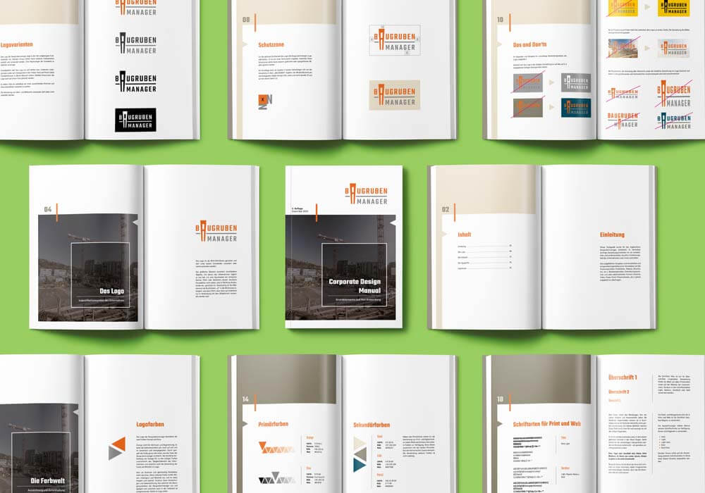
The engineering office baugrubenmanager.com has received its graphic appearance from us. The logo is designed as a word-picture mark and may not be changed or imitated under any circumstances. The graphic element associates various objects that the company deals with on a daily basis, e.g. a sheet pile wall, a stylized drill, pile or similar whose clear perspective is directed downwards, i.e. towards the ground, pit, etc. At the same time, the visual element is designed as a letter. At the same time, the figurative element is integrated into the word mark as the letter "A", which means that the word mark may only be used in conjunction with the figurative element.
Continuing with the logo, we developed a style guide that clearly defines the graphic appearance of the excavation managers. We defined rules for the use of the logo, its exclusion zones and display variants as well as primary and secondary colours with their application and the prescribed fonts. For flyers, we created a design basis that was also used in the first copies.
We created and applied the exterior design of the offices and the stickers on the company cars according to the customer's wishes.
For the dispatch of offers and construction descriptions, we created special dispatch bags and dispatch boxes.
Projects