Ophthalmological practice Dr. med. Karin Leschka
Logo Design and Corporate Design
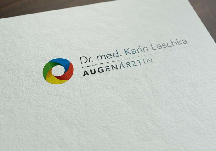
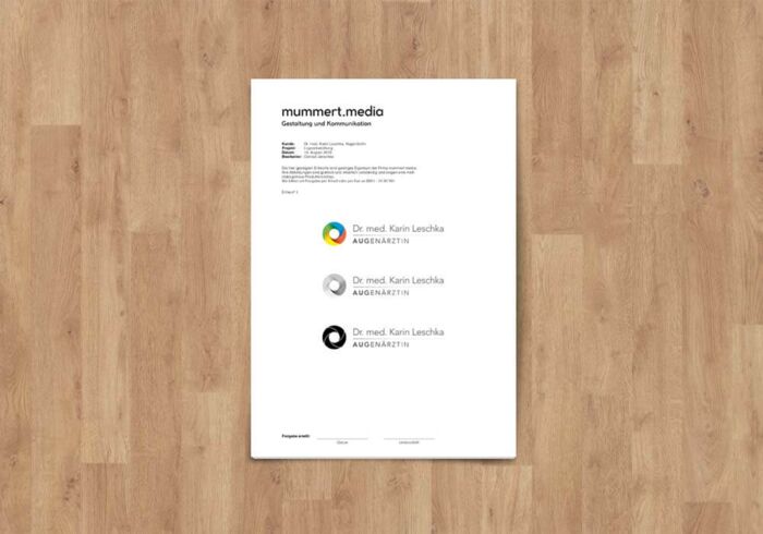
The ophthalmology practice of Dr. med. Karin Leschka has received its new graphic appearance from us. An eye was to serve as the basis for the design of the image element within the logo. Here, we focused on the iris in which the light colours RGB supplemented by yellow are incorporated in the style of an aperture.
The font chosen for the word mark part is clear, simple and very legible. Both in print and on the web.
A line with increasingly smaller dots and the word ophthalmologist, whose capitals are written in an increasingly delicate style, are intended to create an analogy to the eye test.
In the course of redesigning the logo, we also redesigned all the necessary print products, such as letterhead, appointment and visit cards, as well as spectacle and private prescriptions, in the sense of a uniform corporate design and thus defined the first design specifications.
Based on these design guidelines, we also created the website for the ophthalmology practice. More here.
Projects


